"I've wasted so many hours adjusting constraints, yet the position of labels and images in my app still looks way off"
- Randomly adding and removing constraint and hoping it to work when pressing the ▶️ button
- Kept running into conflicting constraints error over and over again
- Xcode told you to change Content Hugging and Content Compression Resistance priorities, but what are these?
- Afraid to make changes on constraints fearing you will get red lines everywhere
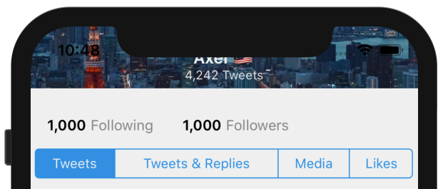
- Finally got it working on your iPhone, but when you view it on iPhone SE, the text doesn't fit
- Finally got it working on your iPhone, but when you view it on iPhone X, the text got clipped by the notch
Adding constraints pretty much feel like guesswork at this point :
- Add constraint
- Run the app
- Tweak the number value of the constraint
- Run the app
- Add more constraint
- Run the app
- Deletes all constraints and start again
You are interested to create an iOS app, you picked up Swift and enjoyed learning it, you managed to create some simple app after following tutorials. But when it comes to designing user interface, Auto Layout doesn't make sense to you, it feels like you have to get lucky to get a layout working.
Months of coding work is getting thrown away as you can’t even get the user interface to display correctly. At this point, you are asking yourself whether it is a good choice to continue iOS programming, as spending the time to fight with Auto Layout doesn't feel worth it anymore.
"Auto Layout shouldn't be that hard!", you exclaimed. Let's take a moment and imagine the following :
What if you are able to create user interfaces which look great on any screen size?
What if you knew exactly which constraint to add for each element? You could save hours from trial and error-ing constraints. You’d know how to troubleshoot constraints whenever your layout looks off from their supposed position. You’d be confident that your app will look exactly like how you want it in all iPhones and iPads. You could finish the app that you have been working on for months, submit it to the App Store, and have a better resume for applying iOS developer positions.
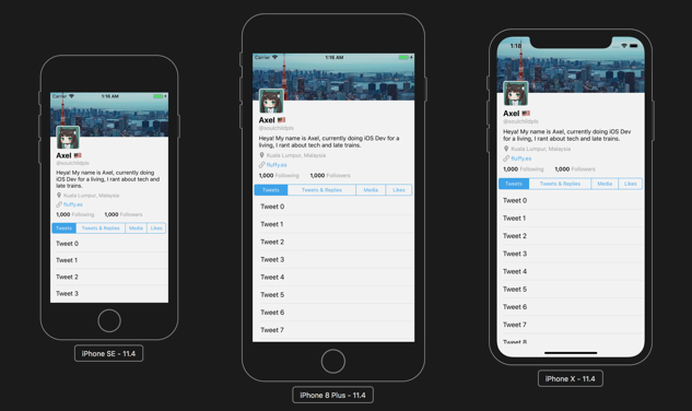
Learn the fundamentals of Auto Layout and create constraint confidently
The problem with Auto Layout is that winging it as you go along is not an option. With coding you often can trial and error until it works, so we are used to it. Auto Layout needs to be properly understood and applied systematically, you have to understand what every single constraint is doing, throwing them in at random until its all blue is never going to work.
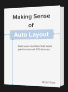
Making Sense of Auto Layout focuses on the fundamentals of Auto Layout including how it decides the position and size of a UI Element (UIView, UILabel etc), what problems do Auto Layout solve, why do Xcode shows you red lines and how to troubleshoot them.
Create layout with dynamic content at ease
Most of the time your app will communicate with a web API that returns JSON content, you can confidently create a layout that cater to dynamic content using Self-sizing table view cells or Scroll views with dynamic height.
By using the help of Stack views, you can add/remove UI element easily into the stack without having to add constraints all over again.
Learn the fundamentals of Auto Layout with
Making Sense Of Auto Layout Book
Start creating the layout you want, looks good across all iOS devices, and submit it to App Store confidently.
What's in the book?
Instead of showing you a specific complex layout to follow step by step, this book breaks down and explain the fundamentals of Auto Layout and let you connect the dots before you start designing your own layout. This book is focused on doing Auto Layout using Interface Builder (Xcode GUI), but its core concept can be applied to doing it programmatically (using code) as well.- How User Interface is being designed prior to Auto Layout and why Auto Layout is introduced
- How Auto Layout determine position and size of a UI Element by using constraints you defined
- Why missing constraints (Red lines!) appear and how to solve them
- Why conflicting constraints (Red lines, with numbers!) happen and how to solve them
- What is intrinsic content size and the importance of it
- Using Tableview for content with dynamic size
- Using Scrollview for content with dynamic size
- What is constraint priority and when to use it
- What is content hugging and compression resistance
- What is Stackview and how does it simplify constraints
- Animating views with constraint
The Book + Case Studies

- The book in PDF format, 156 pages
- ~ 2-6 hours of reading depending on your speed, and you can start apply the knowledge after chapter 4
- 6 practice Xcode projects (Xcode 9.4+) to follow-along the chapters
- Future updates on the book, if available
- 3 case studies (Spotify's Now Playing UI, Twitter Profile UI, Twitter Slide Menu)
- Explanation of each constraints used for replicating the UI in the case studies, and also breakdown of components in the UI
- Completed demo Xcode projects for the Spotify / Twitter Profile UI / Twitter Slide Menu
With the case studies, you'll learn how to breakdown complex UI in other apps into individual components and implement them methodically. You would be able to apply the Auto Layout concept you learned in the book into implementing real layout you saw in other apps.
Just the Book
- The book in PDF format, 156 pages
- ~ 2-6 hours of reading depending on your speed, and you can start apply the knowledge after chapter 4
- 6 practice Xcode projects (Xcode 9.4+) to follow-along the chapters
- Future updates on the book, if available
Just the Case Studies
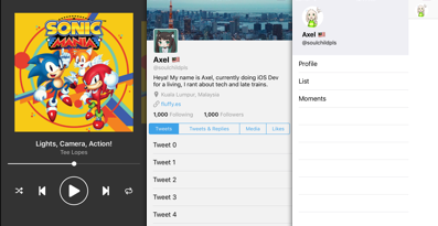
- 3 case studies (Spotify's Now Playing UI, Twitter Profile UI, Twitter Slide Menu)
- Explanation of each constraints used for replicating the UI in the case studies, and also breakdown of components in the UI
- Completed demo Xcode projects for the Spotify / Twitter Profile UI / Twitter Slide Menu
- Compatible with Xcode 9.4+
Testimonials
“dude… wow… good job on this Auto Layout series! One of the best explanations I’ve read!” – Alex Kluew
“I find the book a comprehensive break-down of the basics of Auto Layout, it's definitely a valuable resource for newcomers to iOS development” – Adrian Tineo
Can I try a free sample?
Absolutely! Grab your free sample below and start Making Sense of Auto Layout today.
Understand Auto Layout and design the user interface you want
FAQ
Q: Which programming language will the book use?The book will use Swift 4 for code samples, although majority of the book focuses on interface builder (without code).
Q: How do I know if Making Sense of Auto Layout is suitable for me?
Making Sense of Auto Layout is for iOS Developer who struggle to understand Auto Layout and how constraints work. This book is written with the motivation of aiding beginner iOS developer to gain an understanding of how Auto Layout and constraints works and why Apple designed this way. The book is not about super-complex layout with a step-by-step guide, it is about understanding basics of Auto Layout and constraints.
If you already can implement a responsive user interface using constraints by yourself, and understand how it works, this might not be for you.
Q: What if I’m unhappy with the book?
I want you to be happy with the book, if for some reason you’re not, just send me an email and I’ll give you a refund as soon as I can.
Have other questions? Contact me at axel@fluffy.es, I'll be happy to answer.
About the Author

Hi, I'm Axel Kee. I’ve been developing iOS apps for companies, clients and myself — from small indie app to social app that get hundreds of thousands of downloads — since 2016.
I used to struggle on Auto Layout when I first started picking up iOS development, it took me a lot of practice until it 'clicks' for me. Once I understand the intention behind Auto Layout and how it works, I come to appreciate it as it simplifies UI development a lot.
I hope this book can make it 'click' for you too.
I write about iOS development stuff here.